Brand Guidelines
Assets, colours, typography, and usage guidelines for Jack & Jill. For press or partnership enquiries, contact hello@jackandjill.ai.
Logo
Always use the official logo files. Maintain clear space equal to the height of the “J” on all sides. Never distort, recolour, or add effects.
 Wordmark
 Full logo
App Icons & Favicon
Favicon, PWA icons, and Apple Touch Icon used across devices and platforms.
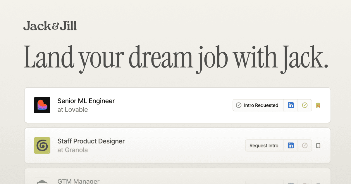
Open Graph Image
Social sharing image at 1200 × 630px. Used by Twitter, LinkedIn, Slack, iMessage, and other platforms that unfurl link previews.
Colour Palette
Three core brand scales defined in oklch for perceptual uniformity. Never use pure black (#000) or pure white (#fff).
Ember
Primary CTA orangeGold
Jill accentTeal
Dark surfacesFeature Card Accents
Six perceptually uniform OKLCH scales used for feature card tints. All scales share identical lightness and chroma at each step: only the hue rotates. Cards use step 50 for backgrounds and step 200 for borders.
Honey
Job Search cards — warm yellow-amberPeach
Negotiation cards: warm coral-orangeSage
Introductions cards: muted greenCyan
Mock Interview cards — cool tealAzure
Salary Benchmarking cards: cool blueLavender
Career Coaching cards: soft purpleSemantic Tokens
| Token | Value | Usage |
|---|---|---|
| Background | oklch(0.985 0.002 75) | Page background — warm off-white with faint cream |
| Foreground | oklch(0.155 0.008 260) | Primary text colour: warm near-black |
| Dark surface | #001f23 | Hero & dark section background |
| Dark surface lighter | #0a292d | Gradient start for dark sections |
| Text on dark | #fffffa | Off-white for text on dark surfaces |
| Accent orange | oklch(0.65 0.22 28) | Primary CTA: Ember-500 |
| Border | oklch(0.905 0.005 75) | Default border colour |
Typography
Headings use Instrument Serif (400, normal & italic). Body text uses the Inter / system-ui stack.
Aa
Heading One
Heading Two
Heading Three
Heading Four
The quick brown fox jumps over the lazy dog.
The quick brown fox jumps over the lazy dog.
The quick brown fox jumps over the lazy dog.
Caption or label text
OVERLINE LABEL
Spacing & Radius
Follows an 8px grid with 4px half-steps. Border radius uses a base value of 10px (--radius: 0.625rem).
Animation & Easing
All animations use ease-out curves for a natural feel. Reduced motion is always respected.
| Token | Value |
|---|---|
| --duration-micro | 100ms |
| --duration-fast | 150ms |
| --duration-standard | 200ms |
| --duration-moderate | 250ms |
| --ease-out-quad | cubic-bezier(0.25, 0.46, 0.45, 0.94) |
| --ease-out-cubic | cubic-bezier(0.215, 0.61, 0.355, 1) |
| --ease-out-quart | cubic-bezier(0.165, 0.84, 0.44, 1) |
| --ease-out-quint | cubic-bezier(0.23, 1, 0.32, 1) |
Shadow
A single, subtle shadow is used throughout the entire project. Never add glows, drop-shadows, or other elevation effects.
0 1px 2px 0 rgba(17, 17, 17, 0.05)Layout Grid
Content sits on a 1200px max-width container with 20px mobile gutters and 32px tablet+ gutters. All sections use this consistent grid.
| Property | Value |
|---|---|
| Max width | 1200px |
| Gutter (mobile) | 20px (px-5) |
| Gutter (tablet+) | 32px (md:px-8) |
| Columns (conceptual) | 12 |
Usage Rules
- ✓Use oklch for all custom colours
- ✓Keep the single shadow-subtle everywhere
- ✓Respect the 1200px max-width grid
- ✓Use Instrument Serif for headings only
- ✓Always respect prefers-reduced-motion
- ✓Use warm off-whites, never pure #fff
- ✗Use gradients or glows on elements
- ✗Use pure black (#000) or white (#fff)
- ✗Add extra shadow variants
- ✗Use hardcoded colour values: use tokens
- ✗Scale-down on pressed states (opacity only)
- ✗Mix heading and body fonts